Look at the diagrams below – they show the same numbers, but the vertical scales, the y-axis, are different. In this example we see how $1,000 grows to almost $300,000 in 50 years with a 12% yearly return.
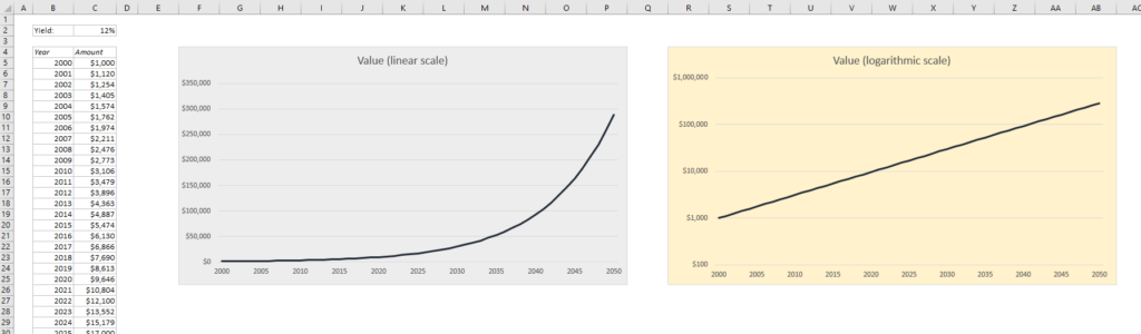
The blue diagram has a linear scale on the y-axis, so the distance between 0 and 50,000 is the same as the distance between 200,000 and 250,000. The yellow diagram has a logarithmic scale with base 10, which means that each interval is increased by a factor of 10. Read more to find out how to do this in Excel, and why you may or may not want to use a logarithmic scale:
The diagram with a linear scale shows very clearly how compound interest works: Not much happens in the beginning, but after a while your capital skyrockets into financial independence. The other diagram, with the logarithmic scale, looks less impressive unless you take a closer look at the units on the vertical axis. It’s also difficult to see where it ends – it looks like somewhere in the middle between $100,000 and $1,000,000, while the linear scale diagram shows quite clearly that the final amount is just shy of $300,00
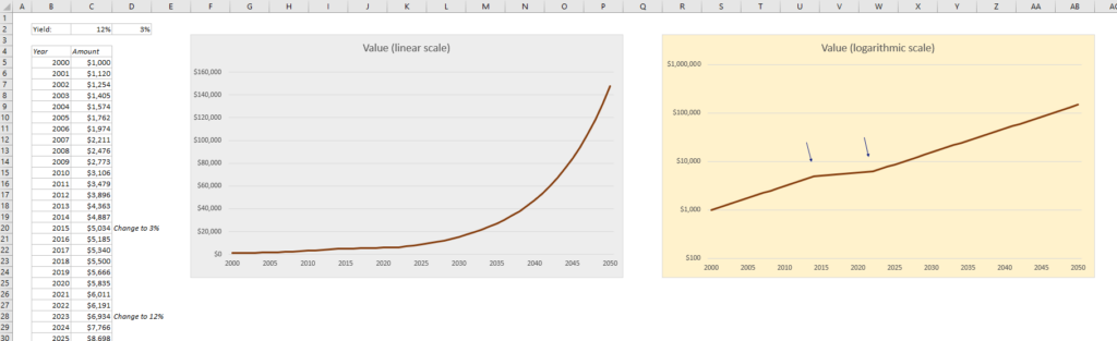
So when is a good time to use the logarithmic scale? Let’s look at another example. In this example we also get a 12% return in the beginning, but after fifteen years the return decreases to 5% and stays there for eight years before it goes back to 12% per year. This is almost impossible to see on the linear scale diagram, but if you look at the logarithmic scale diagram it becomes very clear.
Here’s how to change the x-axis to logarithmic in Excel:
Click on any number on the y-axis to highlight it, and press Ctrl+1 to open the Format Axis panel. Alternatively, you can right-click on a number and choose Format Axis. Make sure the Axis Options icon is chosen on the top (see picture)

Choose Logarithmic scale. In this example I have changes the minimum value to $100 to make it look better than it would with the default value of $1.

Right next to the checkbox for Logarithmic Scale, you can choose the base. Base 10 is usually the best option, where the y-axis values are powers of ten (1, 10, 100, 1000 etc), but you can choose any base you want, e.g. 2, which changes the y-axis values to powers of two (2, 4, 8, 16, 32, 64 etc.)
More Excel tutorials:
- How to Create a Refresh All Button in Excel
- How to use Excel to validate a dataset according to Benford’s Law
- How to Find Duplicates and Triplicates in Excel
- Create a report in Excel in 5 minutes – Beginner’s tutorial
Are you using a non-English version of Excel? Click here for translations of the 140 most common functions in 17 different languages:
Catalan
Czech
Danish
Dutch
Finnish
French
Galician
German
Hungarian
Italian
Norwegian
Polish
Portuguese (Brazilian)
Portuguese (European)
Russian
Spanish
Swedish
Turkish