How and Why you should use a Logarithmic Scale in an Excel Diagram

Look at the diagrams below – they show the same numbers, but the vertical scales, the y-axis, are different. In this example we see how $1,000 grows to almost $300,000 in 50 years with a 12% yearly return.

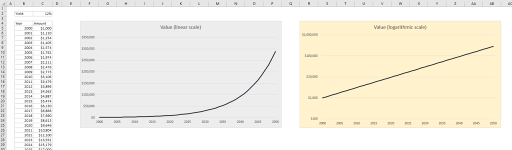
The blue diagram has a linear scale on the y-axis, so the distance between 0 and 50,000 is the same as the distance between 200,000 and 250,000. The yellow diagram has a logarithmic scale with base 10, which means that each interval is increased by a factor of 10. Read more to find out how to do this in Excel, and why you may or may not want to use a logarithmic scale:

READ MORE

How to Create a Dynamic Chart in Excel

In many situations you collect data every day (sales figures, stock prices etc.) for weeks, months and years, while all you want to show in the chart is the last week or two. I’ve seen many people spending a lot of time updating the chart manually every day, so here I will show you how you can make a dynamic chart that always shows the last 7 days. Of course, you can use the same technique for any number of days, weeks or months.

READ MORE

Excel Line Charts: Why the line drops to zero and how to avoid it

Have you ever seen a line chart in Excel that’s suddenly dropping to zero? Here’s why it happens and what to do about it:

Let’s say you have a table where you enter new sales figures every day, and a line chart connected to it. The sales figures for the last few days in the table have not yet been filled out, so the last values for the y-axis are zero. This is what the line chart could look like:

EasyExcel_25_1_Line dropping to zero
READ MORE

5 Easy Steps to Make Your Excel Charts Look Professional

Why do Excel charts usually look so ugly? Ok, they look a lot better in newer versions of Excel than they did before, but you still need to make a few changes if you want them to look good enough for a presentation.

These are the 5 things you can do to make your Excel chart look professional:

READ MORE