Why do Excel charts usually look so ugly? Ok, they look a lot better in newer versions of Excel than they did before, but you still need to make a few changes if you want them to look good enough for a presentation.
These are the 5 things you can do to make your Excel chart look professional:
- Get rid of the legend.
- Make sure the X-axis labels look ok
- Make the gridlines lighter.
- Make the bars wider (if it’s a column chart)
- Add Data Labels
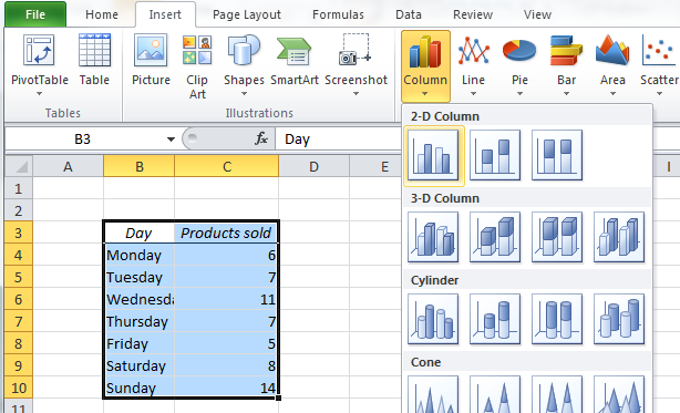
First, let’s make the chart. To make a chart, select the data table, go to the Insert ribbon and choose a chart. Avoid the 3D charts – they never look as cool as you would hope, and they usually turn out to be more difficult to read.
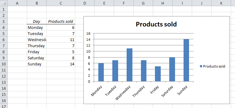
This is the default column chart design in Excel:
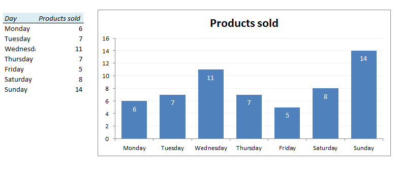
…and this is what it looks like after a 2 minute makeover:
The 5 steps to a professional looking chart

1. Get rid of the legend.
Most charts have only one data series, so the chart title gives you all the information you need.
Click on the legend and hit the Delete key.
2. Make sure the X-axis labels look ok.
In our example, the words are too long, and the alignment looks terrible. There are two ways to solve this problem:
- Change the wording, e.g. Monday to Mon, Tuesday to Tue, etc. Change it in the table, not in the chart!
- Make the chart a little wider. Point your mouse on the right edge of the chart and drag it sideways. That’s what I am going to do here.
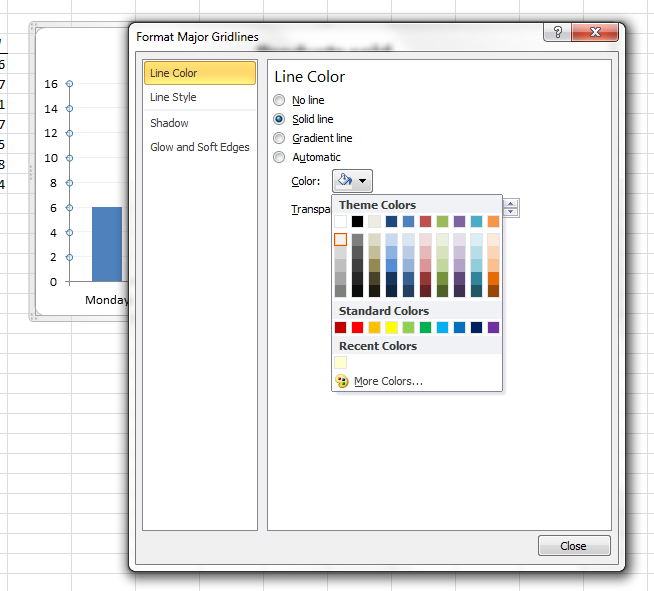
3. Change the gridline colour to light grey.
Double-click on one of the gridlines to open the Format Window. Choose Solid Line and select a light colour. If you want to remove the gridlines all together, simply click once on one of them and hit the delete key.
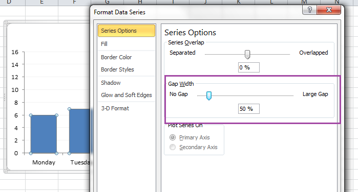
4. Make the bars wider.
Double-click on one of the bars to open the Format Window. Change Gap Width to 50.
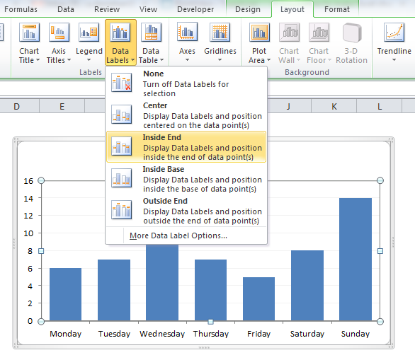
5. Add Data Labels.
Click somewhere on the chart and go to the Layout ribbon. Choose Data Labels > Inside End. Then, right-click on one of the data labels and change the font colour to white.
If you want, you can make the whole worksheet look a little nicer by changing the background colour to white.
Here’s our result again, after our five step makeover:
If you’re happy with this design, you can save it as a template. Click on the chart, go to the Design ribbon and choose Save as Template. The next time you make a chart, all you have to do is to select one cell in your data table and press Alt + F1.
Other tutorials:
- How to Create a Dynamic Chart in Excel
- The Easiest Way to Hide Zeros in Excel
- Create a dynamic drop-down menu in Excel in 4 easy steps
- Create a report in Excel in 5 minutes – Beginner’s tutorial
Are you using a non-English version of Excel? Click here for translations of the 140 most common functions in 17 different languages:
Catalan
Czech
Danish
Dutch
Finnish
French
Galician
German
Hungarian
Italian
Norwegian
Polish
Portuguese (Brazilian)
Portuguese (European)
Russian
Spanish
Swedish
Turkish